There's a quote attributed to Henri Cartier-Bresson (my favorite photographer of all times) that goes: "The only thing worthwhile in photography is geometry. Everything else is mere sentiment".
Part of what makes a picture great is the way it makes the viewer's eyes scan the scene. You probably don't notice it, but every time we look at a picture our eyes follow a path trough it. We cannot focus on the whole picture at once, we follow lines and we eventually come to rest on the natural focus of the picture. Ideally your subject will be the focus, attention should be slowly drawn towards the artistic center of the picture.
Everything in a picture is connected by -real or imaginary- lines. Sometimes lines in the picture will draw your eyes away from the subject, out of the frame; when that happens the picture fails because it cannot keep the attention of the viewer. The picture itself tries to get you to look away!
Sometimes, lines intersect and you get a nice, natural frame in the picture. You know the cliche: The typical picture were a window frames a nice scene in the outside. A picture within the picture.
Natural frames are more common (and useful) than what you may think. Many things can serve as a frame, trees, doorways and windows are super common. Framing people or things with other objects also works.Framing your subject in a way "captures" the viewer's attention. Their gaze will tend to stay within the framed portion of the picture.
And now, for something completely different (I promise I'll return to frames later):
We often get the impression that the goal of photography is to represent reality as perfectly as we can. That may be true at some point for journalistic photography, but if you view photography as an art-form (and I do) then that statement could not be farther away from the truth.
The two most obvious factors leading to this are:
1)COLOR
2) DEPTH OF FIELD
Let's concentrate in the depth of field (DOF). I will tackle color (or the lack of it) sometime in the future.
Technically, the DOF is defined as the portion of the image that remains in acceptable focus. A picture with a shallow DOF will throw everything but the focus point out of focus. On a picture with a deep DOF, everything will be sharp.
Pictures with a shallow DOF are completely unrealistic, yet they are fascinating.
You get a very clear, distinctive center of the picture: the subject, the only thing in focus. The rest is a mystery (and there's mystery again...). That mystery that gets the viewer's mind working, wondering and filling in the gaps.
My writing today is particularly bad, so I will get to the pictures:
Hit the read link to continue...
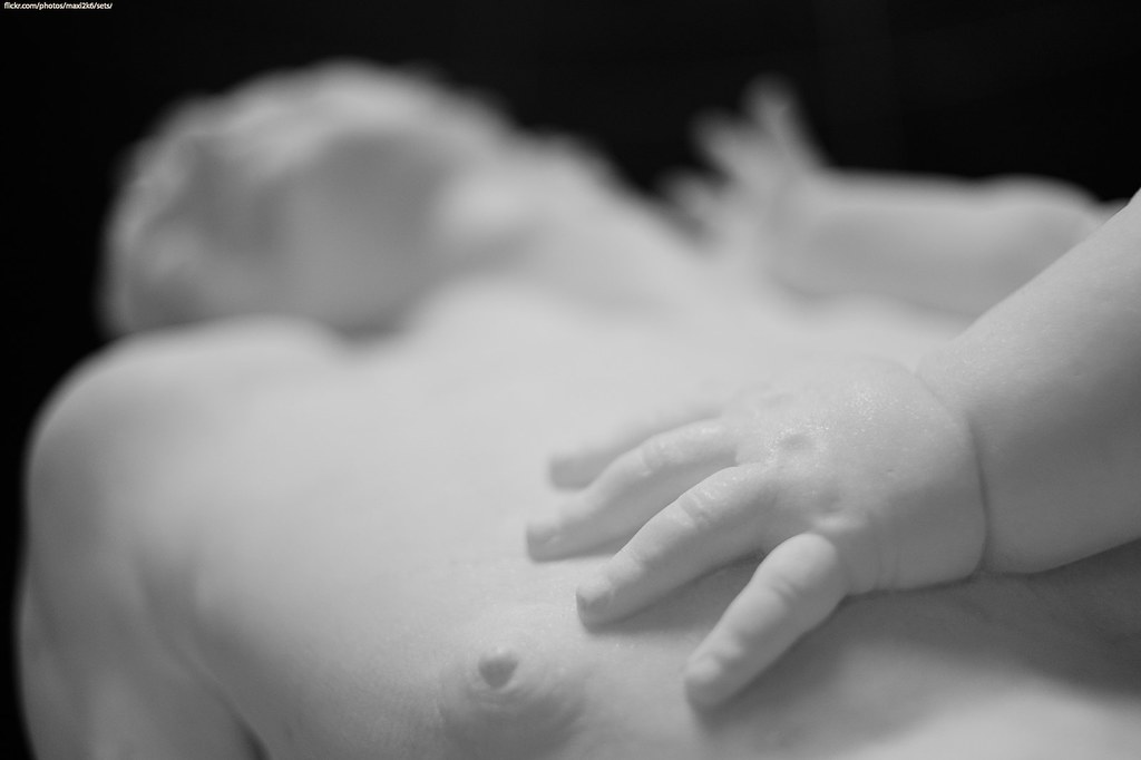
I think this illustrates the point for a shallow DOF quite clearly. The subject of the picture is not the big statue. The subject is the little baby's hand. In fact, the action of touching becomes at some level the central idea of the pic.
Everything in the picture leads you to the hand. The fact that it is in focus makes it even more obvious, but if you start to examine different parts, you'll start seeing lines.
For example, the contrast between the right side of his face (our right, his left) and the background makes your sight follow an imaginary line towards the bottom right, where the hand is. Something similar happens with the actual borders of the picture. If you look at the framing, the left and top borders of the picture are black, while the right and bottom ones are white. This effectively cuts the image in half diagonally. There's a "dark" side (top left) and a "light" side (bottom right); our eyes go from dark to light.
I would love to have a version of this pic with the face, instead of the hand, in focus. Not because I would like it more, but to compare. To see why one works and the other doesn't
What I do have is these two pictures:


The framing is a bit different cause I was moving around at the time, but essentially they are the same picture with different subjects.
In my opinion, the one that works best is the one with the gun in focus. Not only it makes more sense from a storytelling point of view, but the gun is also perfectly positioned in the frame. In here you also have all kind of lines: the "focus" diagonal, hairs, the horizon, the lines of her body, etc. There's even a frame, made up partially with the girl's leg, surrounding the gun. All this leads your attention to the subject.
The picture has a problem though, the "empty" space at the right where light gets through the girl's legs. That little patch of light disrupts the harmony of the image and draws your eyes to it. But there's nothing interesting to see there, it just competes for the attention. If I were to use it, I would probably crop the image. Maybe a square crop would work well.
The bottom picture focuses on the toes. The scene changes completely. Note that the gun is still framed a bit by her body, but now your eyes kind of wonder towards the gun and quickly fall back on the leg.
Finally, don't forget there's no rules. Experiment on the field and analyze the keepers later, as Henri Cartier-Bresson supposedly said: " Get the shot first, look for the geometry later!"
:)
No hay comentarios:
Publicar un comentario